RNN Language Model and TensorBoard
In my previous post I used a model similar to Skip-Gram to learn word vectors. For this project I built a RNN language model so I could experiment with RNN cell types and training methods. Because I recently watched a great TensorBoard demo from the TensorFlow Dev Summit, I’ve also added extensive TensorBoard visualization to this project.
This post is only a brief summary. For a more detailed write-up and project code, go to the GitHub Project Page.
Background
I felt I had a good understanding of Recurrent Neural Networks (RNNs), but you don’t fully understand something until you implement it yourself. Previously, I built a useful toolbox for loading and processing books from Project Gutenberg. So, for this project, I stuck with the task of language modeling. Again, I used three Sherlock Holmes books.
RNN Architecture
The Internet is filled with examples character-based RNNs. And, I can understand why: it is amazing to see a computer learn to construct sentences character-by-character. There is even an example of a RNN generating C code after training on the Linux code base. The character-based approach also has the practical benefit of only needing a ~40-way softmax (alphabet plus some punctuation). But, because we think in words, not letters, I trained my RNN on sequences of words.
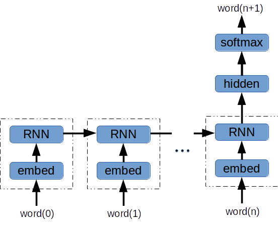
The architecture is straightforward:
- Embedding layer between the one-hot word encoding and the RNN
- RNN: Basic RNN or gated-cell (GRU or LSTM)
- Hidden layer fed by final RNN output
- N-way softmax (N = vocabulary size)
TensorBoard
Before now I had never tried TensorBoard. I was content to pull results from a graph and use matplotlib. But, as I mentioned above, I saw a great TensorBoard demo at the TensorFlow Dev Summit. So I decided to give it a try.
From time to time we’re all guilty of hacking at a problem. There is an energy barrier against adding probes to your model, re-running the job and figuring out what is going on. So, we hack at it for a little too long and hope we get lucky. TensorBoard makes it easy to be disciplined. It is simple to monitor tensor summaries or custom scalar summaries. You can then compare runs and even examine your graph construction. In fact, you may as well monitor everything right from the start - then the information is ready when you need it.
Let’s start by looking at the graph:
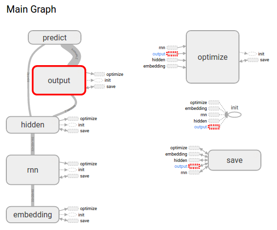
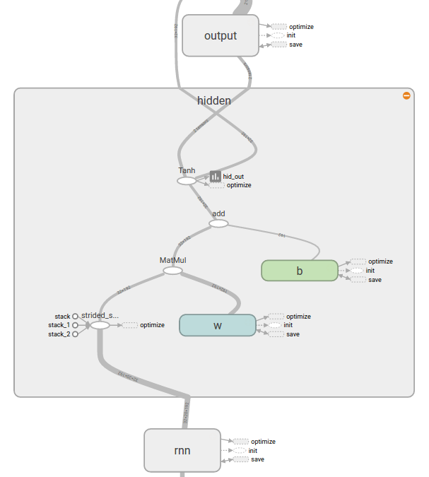
It is very easy to explore the hierarchy of the design. Here we zoom into our hidden layer [matrix multiply W, add the bias b and apply the tanh()]:
The graph construction looks correct. Now we can examine the training results. As you’d expect, you can overlay multiple training-loss curves. You can zoom and easily display the values at the cursors. If you have many runs, there is a regular expression filter to grab just the plots you want.
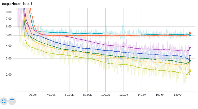
Here I’m taking a look at batch-loss for various hyperparameter settings:
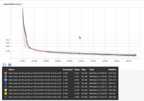
The horizontal axis units can be training steps, relative CPU time or wall clock time. Relative CPU time highlights cases where a model trains in fewer batches, but is still ultimately slower.
Let’s dig deeper into the results. In this series of loss curves you can see 2 runs got stuck on a plateau:
Can we figure out what happened? Take a look at some histograms:
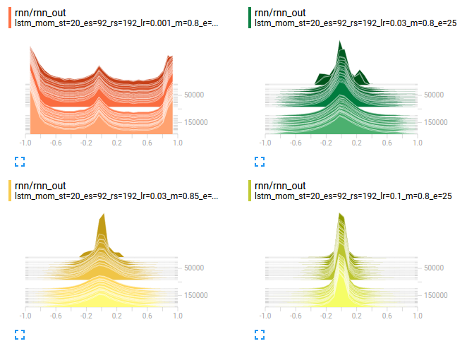
The histograms layer towards you to show the evolution of the training. In the upper-left plot, we can see many of the RNN activations (i.e. tanh outputs) are pegged at +/-1.
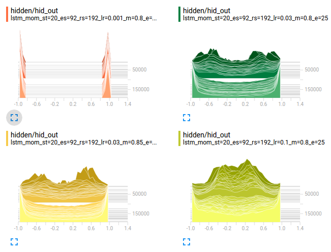
The situation is even worse at the hidden layer - almost all the activations are saturated. Back-propagation isn’t going to be able to make it through this (again, the upper-left plot):
So, how did this happen? TensorBoard provides us a second view of how these activations evolved through training:
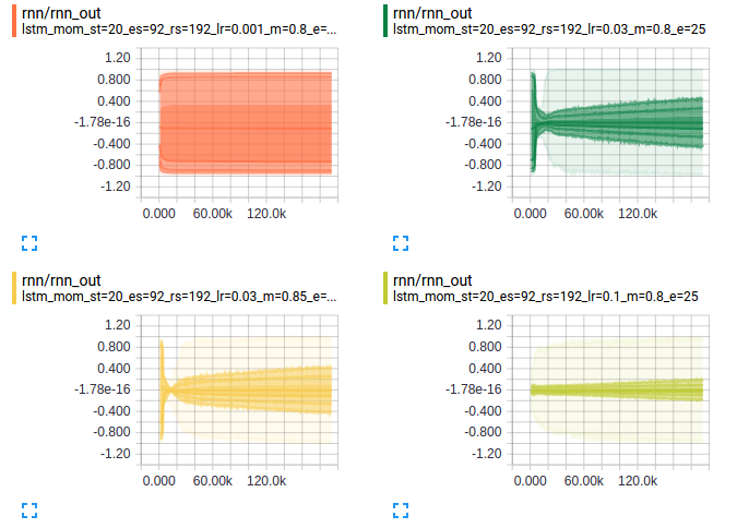
Each level of shading in these plots represents +/-0.5sigma, +/-1sigma, +/-1.5sigma, and then min/max. The picture is starting to come together. It looks like we had exploding gradients at the beginning of training. 3 of the 4 scenarios exploded. But the learning rate is much lower for the upper-left plot, so it doesn’t recover during our training. It probably makes sense to add gradient norm clipping.
Now that we’ve found training parameters that work well, let’s look at the learned word embeddings. TensorBoard lets you interactively explore embeddings in 3D:
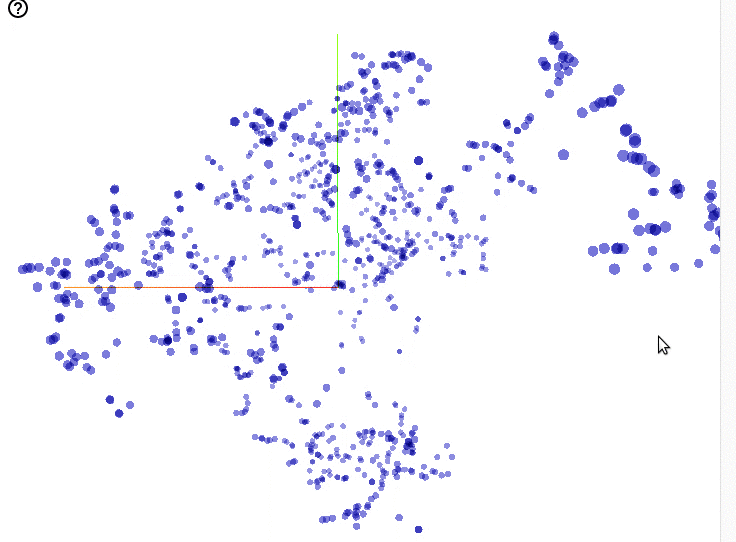
This visualization provides immediate feedback that the model is on the right track: showing clear word relationships within clusters. Aside from being very productive, TensorBoard makes it fun to explore the results and gain better insight into your model.
Wrap-Up
It is easy to underestimate how important a good machine learning visualization tool is. Even a simple model, like I presented here, can fall short in complicated ways. You may not even realize your model is under-performing. TensorBoard dramatically reduces the energy required to dig in and understand what’s going on.
I hope this post inspires you to give both TensorFlow and TensorBoard a try. A short Python Notebook in the GitHub repository implements everything you see here.